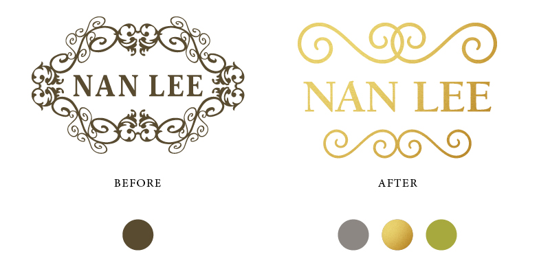
A few months ago Nan Lee inquired about "refreshing" her logo. When she started her business in 2008 she felt that she made decisions so fast that the logo she picked wasn't precisely the vibe she wanted to project. At the same time, she didn't want to reinvent the wheel and make the brand unrecognizable to her loyal customer base. We decided the best course of action would a refresh — subtle refinements to project a more elegant feeling to better match the aesthetic of her business. The updated color palette uses gold foil and chartreuse green.